Take-Home Design Exercise · UX/UI Design · 2025
EasyMed
Registration flow for a health services app designed for non-digital-native users. Two days, end-to-end, from research to hi-fi prototype.

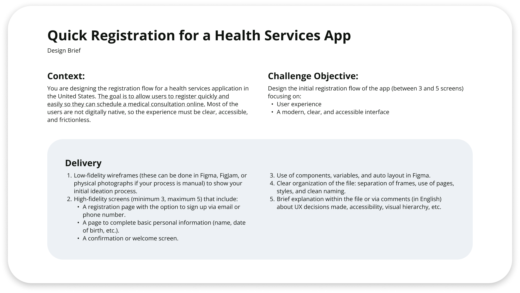
01 The Brief
The brief had one line that changed everything: most users aren't digitally native.
This project was a take-home design exercise completed over two days as part of a company interview process. The brief asked for a registration flow for a U.S. health services app, with one defining constraint: most users are not digitally native. That constraint shaped every decision in the project, from information architecture to visual hierarchy. Designing for this audience is not primarily a usability challenge. It is a trust challenge.
02 Research
No user interviews. So I built a research structure that made every assumption visible and every decision traceable.
The two-day scope did not allow for primary user research. In response to this constraint, I structured the research phase around explicit assumption documentation, analogous studies, and established frameworks to define the problem space before moving into design. The objective was to ensure that every design decision could be traced back to a specific user need or behavioral insight, rather than relying on aesthetic judgment alone.
What I assumed before designing anything
Prior to any design work, I documented my assumptions about non-digital-native users in order to interrogate them rather than rely on them uncritically. Each assumption was evaluated against the brief and analogous research, and either incorporated into the design rationale or discarded. User goals were derived directly from the brief and informed the hierarchy of features throughout the flow.

Structuring the full context before touching the UI
Before opening Figma, I completed a Product Design Canvas to establish the full project context: the product goal, the audience, the conditions of use, the design constraints, and the criteria for success. This exercise surfaced the KPIs that would later validate design decisions: registration completion rate, time to sign-up, bounce rate per screen, and user satisfaction post-flow.

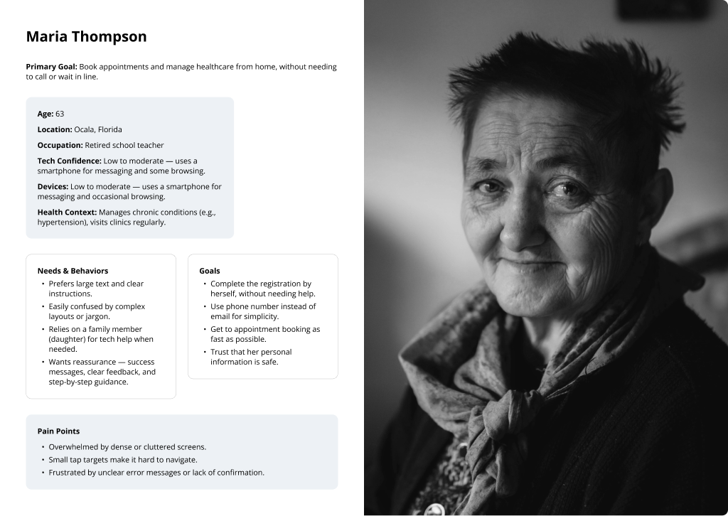
Designing for Maria, not for the average user
The persona, Maria Thompson, is a 63-year-old retired school teacher in Ocala, Florida. She uses a smartphone for messaging and occasional browsing, has low-to-moderate digital confidence, and manages chronic health conditions that require regular medical attention. Her primary goal is to book appointments independently without needing to call or visit a clinic. Maria represents the most common, and most commonly underserved, user type for this kind of health services platform.
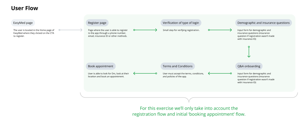
Scoping the work within the full journey
The complete user journey spans seven stages, from the EasyMed landing page through to appointment booking. Design work was scoped to the registration and initial onboarding flow, in line with the brief. Mapping the full journey before scoping ensured that handoff points between stages were accounted for and that nothing critical was excluded from the registration design.
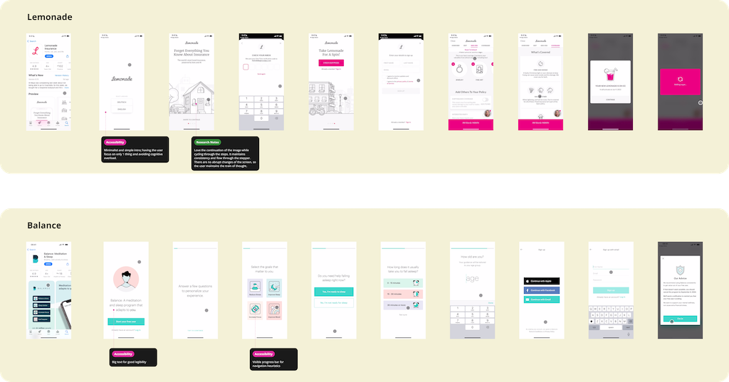
Eight flows analyzed to find what works for low-confidence users
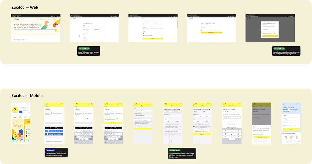
Eight onboarding flows were analyzed across healthcare, insurance, wellness, and SaaS categories to identify interaction patterns, accessibility approaches, and UX decisions relevant to a low-confidence user audience. Each app was reviewed and annotated in Figma across four categories: Accessibility Research Notes Interaction Future Feature
- Accessibility Single-focus screens throughout the onboarding flow. Each step presents one decision point with no competing CTAs or secondary navigation, reducing cognitive load for users with low digital confidence.
- Accessibility Persistent background image across all steps maintains spatial context during transitions. Users retain a sense of location within the flow without requiring an explicit progress indicator.
- Accessibility Consistent application of WCAG-compliant touch targets, large-scale typography, and bottom-anchored progress indicators across the full onboarding sequence.
- Research Notes Personalization questions are presented prior to account creation. This approach builds user investment and establishes perceived value before requesting personal data, reducing early drop-off.
- Future Feature The pre-auth personalization model could be applied post-registration in EasyMed to enable progressive health profile collection across multiple sessions, reducing upfront form friction while improving data quality over time.
- Research Notes Transitional loading screens display contextual copy describing processing activity ("Analyzing your preferences"), converting latency into a perceived value moment rather than a passive wait state.
- Research Notes Custom iconography reduces dependency on text labels throughout the interface. Consistent visual language supports faster pattern recognition and lowers reading demand across the flow.
- Interaction Input fields implement four distinct visual states: default, focused, error, and complete. Clear state differentiation reduces user uncertainty during form interaction and supports error recovery without requiring re-reading instructions.
- Research Notes Profile completion is segmented into labeled micro-steps with visible progress counters. Chunking reduces perceived task length and maintains user momentum through multi-screen data collection sequences.
- Accessibility A single feedback component serves both error and success states through contextual copy variation. Consistent component behavior reduces the number of distinct UI patterns a user must learn to interpret.
- Research Notes Modal layout separates instructional content (left column) from input fields and primary CTA (right column), aligning with natural left-to-right reading flow and reducing eye travel between guidance and action.
- Research Notes Previously entered values are surfaced as inline tags on subsequent steps, providing persistent context and eliminating the need for users to recall earlier inputs during multi-step form completion.
- Research Notes Registration is contained within a modal overlay positioned over the landing page. The underlying context remains visible and dimmed, preserving spatial orientation and reducing the cognitive cost of navigation.
- Interaction Field-level validation triggers on blur rather than on form submission. Errors are surfaced at the point of input, allowing users to correct mistakes in context before proceeding to the next step.
- Research Notes Authentication options are presented with clear visual hierarchy: email as a filled primary button, social login options as secondary outlined variants. Alternative paths remain accessible without competing with the primary CTA for visual attention.
- Interaction Error state applies a high-contrast red border on blur, providing immediate visual feedback. A tooltip activated on focus delivers field-specific guidance without permanently occupying screen space.
- Research Notes Each input field is paired with a contextual tooltip that activates on tap, providing field-level guidance without adding permanent helper text to the layout. Increases information density on demand without cluttering the default view.
- Interaction Auth hierarchy mirrors the web experience: email as the primary input, alternative sign-in methods presented below as secondary options. Cross-platform consistency reduces relearning when users switch between devices.


03 Aligning Goals
Mapping both sides before touching the IA kept the design from optimizing for one at the expense of the other.
Business objectives and UX goals were mapped before any information architecture decisions were made. In a healthcare context, these two sets of priorities tend to align more closely than in other product categories, but the friction points remain distinct. Documenting both explicitly ensures the design does not optimize for conversion metrics at the expense of user trust, or prioritize user comfort in ways that compromise the data requirements the platform depends on.
- Get users through registration without dropping off. Every screen is a potential exit.
- Collect enough to match users to doctors and handle insurance. Not more.
- Handle consent and data privacy in a way that would survive legal scrutiny in a U.S. healthcare context.
- Work on whatever device the user already has. Can't assume a recent iPhone.
- Keep non-digital-native users on the platform after registration. They're the hardest to acquire and the first to churn.
- If a field doesn't have a clear reason to be there, cut it.
- No jargon. If someone's never scheduled a medical appointment online, every unfamiliar term is a reason to quit.
- Consent in plain sentences, not a wall of legal copy. Short, specific, skippable where appropriate.
- Large tap targets, single-column layout, no time-outs. Design for someone who types slowly and holds the phone at arm's length.
- The flow should feel like it's on the user's side, not trying to extract information from them.
04 Lo-Fi Wireframes
Five screens sketched and annotated before opening Figma. Each one with a clear job before a pixel was placed.
Low-fidelity wireframes were developed for all five screens before moving to high-fidelity design, covering both desktop and mobile breakpoints. Each wireframe was annotated directly with research notes, interaction decisions, and accessibility considerations. This phase was used to validate layout logic and screen scope before committing to visual design.

Email on desktop, phone on mobile
Email is the primary registration input on desktop, where users are more likely to have it accessible. On mobile, the primary input shifts to phone number, aligning with the device in the user's hand and the behavioral patterns of the target audience.
SMS code, OS does the heavy lifting
Account verification is handled via SMS code. On most mobile devices, the operating system offers to auto-fill the verification code, reducing manual input and the risk of users switching between apps. All input fields display a persistent label above the field in addition to placeholder text, supporting legibility for users with low digital literacy.
Two or three fields max. Progress visible.
A persistent progress bar at the top of each form screen communicates completion status and reduces perceived task length. Form inputs are positioned on the right side of the layout, with labels on the left, consistent with left-to-right reading direction. The number of inputs per screen is kept minimal to reduce cognitive load across a multi-step flow.
Drop-downs as the single input type
The insurance questions screen uses only drop-down selectors. Limiting the screen to a single input type reduces the number of interaction patterns the user must learn and minimizes the risk of input errors. The single-column layout is maintained for consistency with the rest of the flow.
What kind of doctor do you need?
The Q&A onboarding step captures the user's medical specialty preference before they reach the appointment booking screen. This input is used directly to pre-filter available doctors, creating a seamless transition from registration into the core product experience.
05 High-Fidelity Design
Five screens built as a system, with every layout and interaction decision documented and justified.
High-fidelity screens were developed in Figma for both desktop and mobile, using the component library and variable system built for this project. Each screen is annotated inline with rationale covering layout decisions, interaction states, and accessibility considerations. The design is built as a system, not a collection of individual screens.
On using Lovable.ai: The EasyMed landing page and appointment booking section, which fall outside the registration scope defined by the brief, were generated using Lovable.ai. This allowed the available design time to be focused on the core registration flow. The use of AI generation tools for out-of-scope sections is a considered decision, not a shortcut: it preserved design capacity for the work the brief was actually evaluating.

Why each screen looks the way it does
Multiple ways to register, upfront
The registration screen presents email as the primary input on desktop, with clearly labelled secondary options for phone number, insurance ID, and Medicaid ID. The primary input adapts to the device context: on mobile, phone number is elevated as the primary path. Providing multiple registration routes from the first screen prevents drop-off caused by users not having their email address immediately accessible.
A person, not an icon
The registration screen uses a large photographic image of an older adult rather than a medical illustration or abstract icon. The visual choice was deliberate: before a user reads a single word or fills a single field, the image communicates that this product was designed for someone like them.
Verification as an overlay, not a new page
Account verification is presented as a modal overlay positioned over the registration screen rather than as a full page transition. The user retains visual context of where they are in the flow, reducing the likelihood of interpreting the verification step as an error or an unexpected navigation event.
Inputs on the right. Labels lead, fields follow.
On the demographic and insurance screens, form inputs are positioned on the right side of the layout with labels on the left. This arrangement aligns with left-to-right reading flow, ensuring users process the field label before reaching the input. For users who are slower to read or unfamiliar with form conventions, this reduces scanning errors and re-reading.
Privacy in plain sight
A brief privacy statement is displayed inline on the registration screen, visible before the user begins filling any fields. Links to the full Terms of Use and Privacy Policy are present but visually subordinate. Surfacing the privacy commitment at the start of data collection, rather than at the end, addresses the trust barrier before it becomes a reason to abandon the flow. Terms and Privacy Policy links are there, but subordinate.
06 Prototype
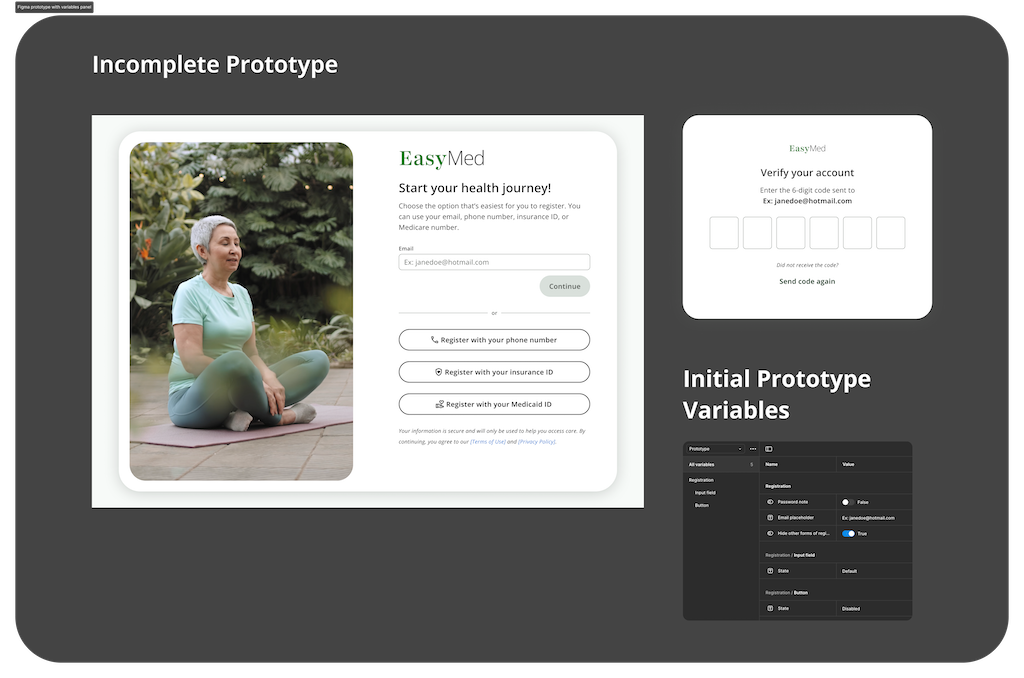
Prototype variables let one Figma file simulate multiple user scenarios without duplicating a single frame.
Rather than building the prototype through frame duplication and linear connections, I used Figma prototype variables to drive component state changes across the flow. Variables control input field behavior (password visibility toggle, email placeholder state), button enable and disable states, and form logic. This approach allows a single set of frames to simulate multiple user scenarios, reducing prototype maintenance and more closely reflecting how the front-end implementation would function.
Within the two-day timeframe, the prototype covers the registration and verification screens. The variable architecture and component state logic are fully established. Extending the prototype to cover the remaining screens requires additional connection work, not structural changes.

Figma prototype variables panel. Variables control input field states and button behavior across the registration and verification screens, including password visibility, email placeholder population, and button enable/disable logic.
Where the registration flow hands off to the actual product
Upon completing registration, users are directed to the appointment booking section, which represents the primary goal of the entire flow. The video below shows the Lovable.ai prototype of this section, included to provide a complete view of the end-to-end user journey within the scope of the exercise.
07 Component System
A shared component library means any new screen inherits consistent states, spacing, and behavior from day one.
All interface elements in the high-fidelity design are built as Figma components with documented variants, interaction states, and auto-layout. The library is structured for development handoff: a developer opening the file can identify component behavior, state logic, and intended usage without additional documentation. Annotations within the file follow a color-coded format consistent with the research phase: pink for accessibility, green for research notes, blue for interaction, and orange for future features.
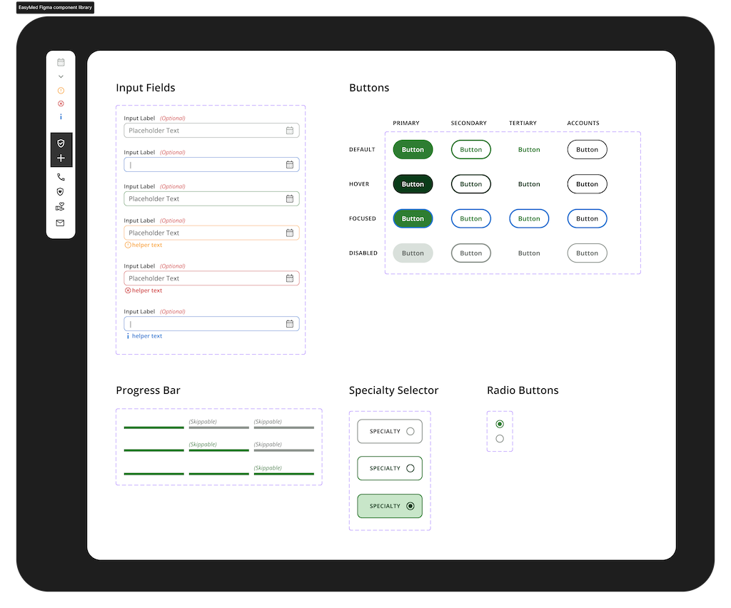
| Component | Variants & States |
|---|---|
| Input Fields | Default / Focused / Filled / Error / Disabled / Info. Label always visible above the field. Never relying on placeholder text alone. |
| Buttons — Primary | Default / Hover / Focused / Disabled. Green fill, white text. The one action you want the user to take. |
| Buttons — Secondary | Default / Hover / Focused / Disabled. Outlined. Present as an alternative, not competing for attention. |
| Buttons — Tertiary | Default / Hover / Focused / Disabled. Text-only. For actions that don't need visual weight: "Skip", "Learn more". |
| Buttons — Account | Default / Hover / Focused / Disabled. Used for the alternative sign-in options: phone number, insurance ID, Medicaid ID. |
| Progress Bar | Skippable / Non-skippable variants. Active, complete, and inactive step states. Always visible at the top of form screens. |
| Specialty Selector | Default / Selected / Active. Used in the Q&A step. One tap selects a doctor type and advances the flow. |
| Radio Buttons | Unselected / Selected. Insurance questions and preference screens where a single answer is required. |
08 Design System: Variables
A three-tier variable system so developers receive values with intent attached, not a list of hex codes to interpret.
The design system is structured around Figma Variables organized in three tiers. Primitive tokens hold raw values: spacing increments, color hex codes, and font specifications. Semantic tokens assign purpose to those values, mapping them to specific UI roles such as error states, button surfaces, and border colors. Components reference semantic tokens rather than primitives directly, ensuring that a change at the token level propagates consistently across the entire system.
Misc Measurements
Grid columns, breakpoints (320–640px), and the full font spec: size, line height, letter spacing, family, weight.
Primitive Tokens
Raw values only: spacing from 6px to 60px, button stroke weights, the base color palette. No meaning attached yet.
Semantic Tokens
This is where intent gets attached. Background/primary maps to a color. Button/primary/surface/hover maps to a specific shade. Every interactive state across all four button types is covered.
Two fonts, one job each
Open Sans was selected as the primary typeface for its legibility at small sizes, clean cross-device rendering, and neutral character appropriate for a healthcare context. It is used across all functional UI elements: form fields, labels, body copy, and navigation. Playfair Display is used selectively for display text and brand moments where warmth and visual distinction are needed. The pairing maintains clarity throughout the interface while avoiding a purely clinical aesthetic.
A palette built for trust, not for clinical sterility
The palette is anchored by EasyMed's brand green, chosen to communicate health and approachability without the clinical coldness common in blue-dominant healthcare interfaces. The dark forest green provides visual weight and credibility at the brand level, while lighter tones are used for surfaces and accent states. All colors are implemented through the semantic token layer, ensuring every usage is intentional and traceable to a specific UI role.
09 Reflections
Two days is enough to make good decisions. Here's where I'm confident, where I'd want data, and where I'd invest more time.
A two-day design exercise produces decisions, not validations. The work below distinguishes between what is grounded in established research and sound UX rationale, what would require usability testing to confirm, and what would be approached differently given more time.
Confident about
- The five-screen flow addresses the full scope of the brief without introducing unnecessary steps. Each screen has a defined role in the user journey.
- Four registration entry points on screen one. This decision reflects documented behavioral patterns in non-digital-native user research, not a design preference.
- The token architecture is structured for immediate development use. Primitive, semantic, and component layers are all documented within the Figma file.
- The component library covers all interactive states required for a development handoff, with no gaps in variant coverage.
Would test first
- The verification overlay model has not been tested with the target user group. There is a risk that users unfamiliar with modal interfaces interpret the overlay as an error rather than a deliberate step.
- The Q&A onboarding step may introduce friction immediately before the appointment booking screen. Usability testing would determine whether it increases booking completion or reduces it. An alternative approach would be to defer this step to post-registration.
- The effectiveness of the progress bar for this specific user group is unvalidated. Research on older adult users and progress indicators shows mixed results. This would be the first element to test in a usability session.
Would do differently
- At minimum one guerrilla research session with a user over 60 before beginning design. The persona is constructed from analogous research and behavioral assumptions, not observed behavior. Twenty minutes of direct observation would have improved the fidelity of every subsequent decision.
- Complete the Figma prototype to cover all five screens. The variable architecture and component states are fully in place. The remaining work is connection logic, estimated at three to four additional hours.
- Comparative testing of the granular consent toggle model against a simplified single-accept approach with a 'learn more' disclosure option. The granular model is the current implementation, but its impact on completion rate versus a simpler alternative has not been measured.
Feel free to contact me.
Like my thinking?